
STEFAN EMMANUEL

A MULTIDISCIPLINARY DESIGNER AND ILLUSTRATOR

Ayubowan. I'm Stefan Emmanuel, a multidisciplinary designer and recent graduate of Vancouver Island University, based in Nanaimo, BC. My work spans from brand identity, package design, editorial design, and illustration, with a particular emphasis on athletic design.Growing up between Sri Lanka and Muscat, Oman before landing in Canada meant I was always navigating between different cultures, aesthetics, and ways of communicating.That multicultural lens became the foundation of how I design. I'm drawn to work that feels rooted in something real, whether that's heritage, place, or community and purposeful work that connects with the people it's made for.I'm currently looking for my first full-time design role.
STEFAN EMMANUEL
I look forward to connecting with you!

Resume Page 1

Resume Page 2


STEFAN EMMANUEL
Design Portfolio

STEFAN EMMANUEL
Cusheon Lake Resort
Brand Identity and Visual System
Adobe Illustrator, Photoshop, and InDesign
A brand identity rooted in nature, built for Salt Spring Island.

Project 2


Mockups


Mockups


Mockups


Mockups


Mockups


Mockups


Mockups

The Challenge
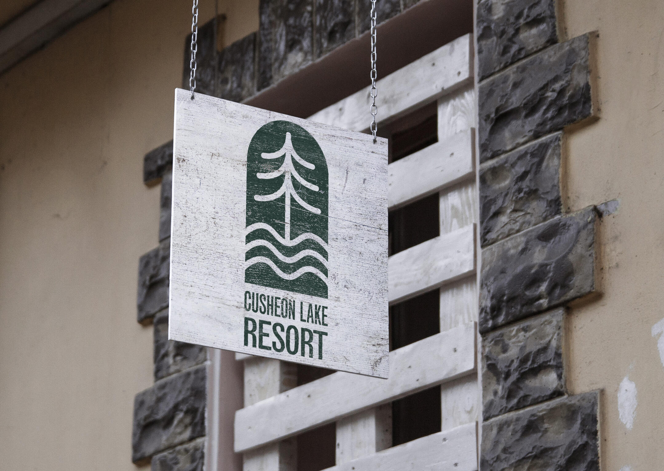
The challenge was to create a rebranded identity for Cusheon Lake Resort that captures the calm, natural experience of the location while remaining clear, modern, and adaptable across multiple applications. The identity needed to communicate a sense of place rooted in nature and relaxation while functioning across signage, promotional materials, and digital platforms. The main question became: How can a visual identity reflect a physical environment without feeling overly literal or decorative?
The Approach
My approach focused on translating elements of the natural environment into a simplified visual system. I explored forms inspired by the lake, surrounding landscape, and organic shapes, aiming to create something that feels calm, balanced, and timeless.
Rather than overcomplicating the design, I focused on clarity and simplicity. The goal was to create an identity that feels grounded in nature but flexible enough to work across different contexts and applications.
Outcome
I developed a primary logo mark that reflects the surrounding environment through simplified form and composition. Supporting typography and layout decisions were designed to reinforce a calm and approachable tone. The identity was applied across various touchpoints to demonstrate consistency and scalability, resulting in a cohesive system that represents the resort while remaining clean and adaptable.
STEFAN EMMANUEL
Canadian Collegiate Athletic Association (CCAA) Men's Basketball National Championship 2026
Event Identity and Visual System - Sports Media
Adobe Illustrator, Photoshop, Indesign, After Effects & Premiere Pro
The national stage, designed for VIU.

Mockups


Mockups

Mockups

Mockups

Mockups

Mockups

Mockups


Event Photography

Motion Graphics
Click the link to watch
Overview
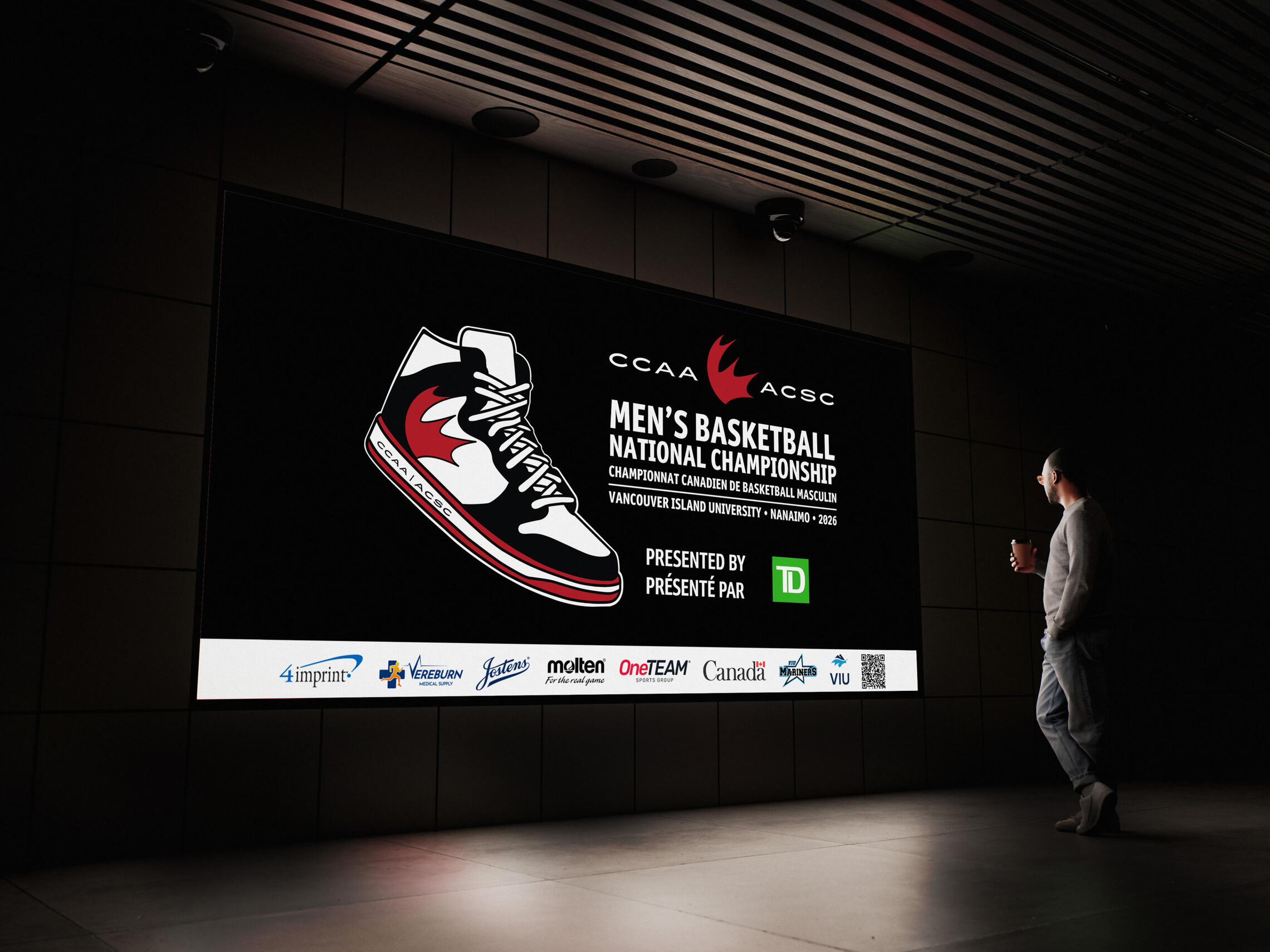
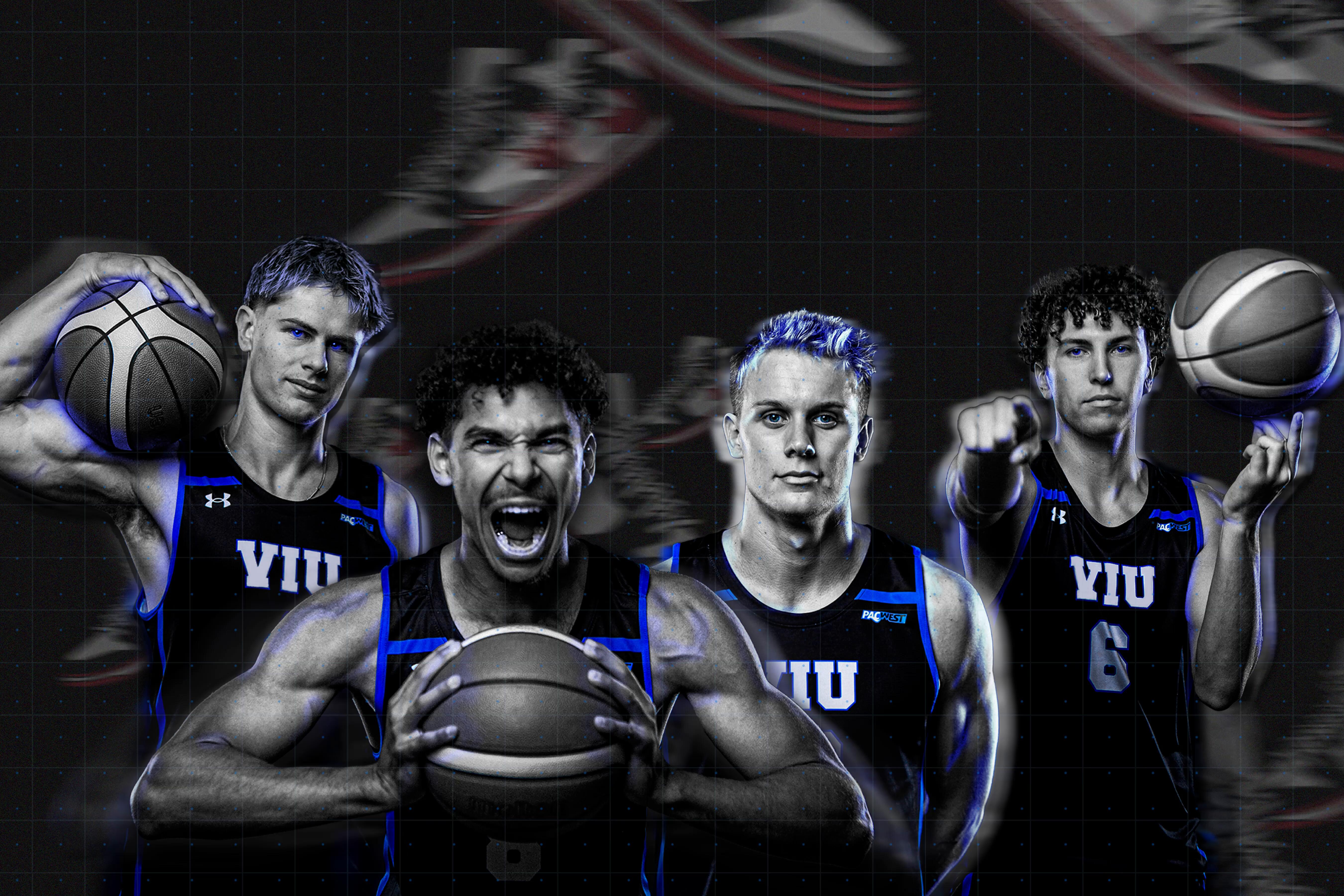
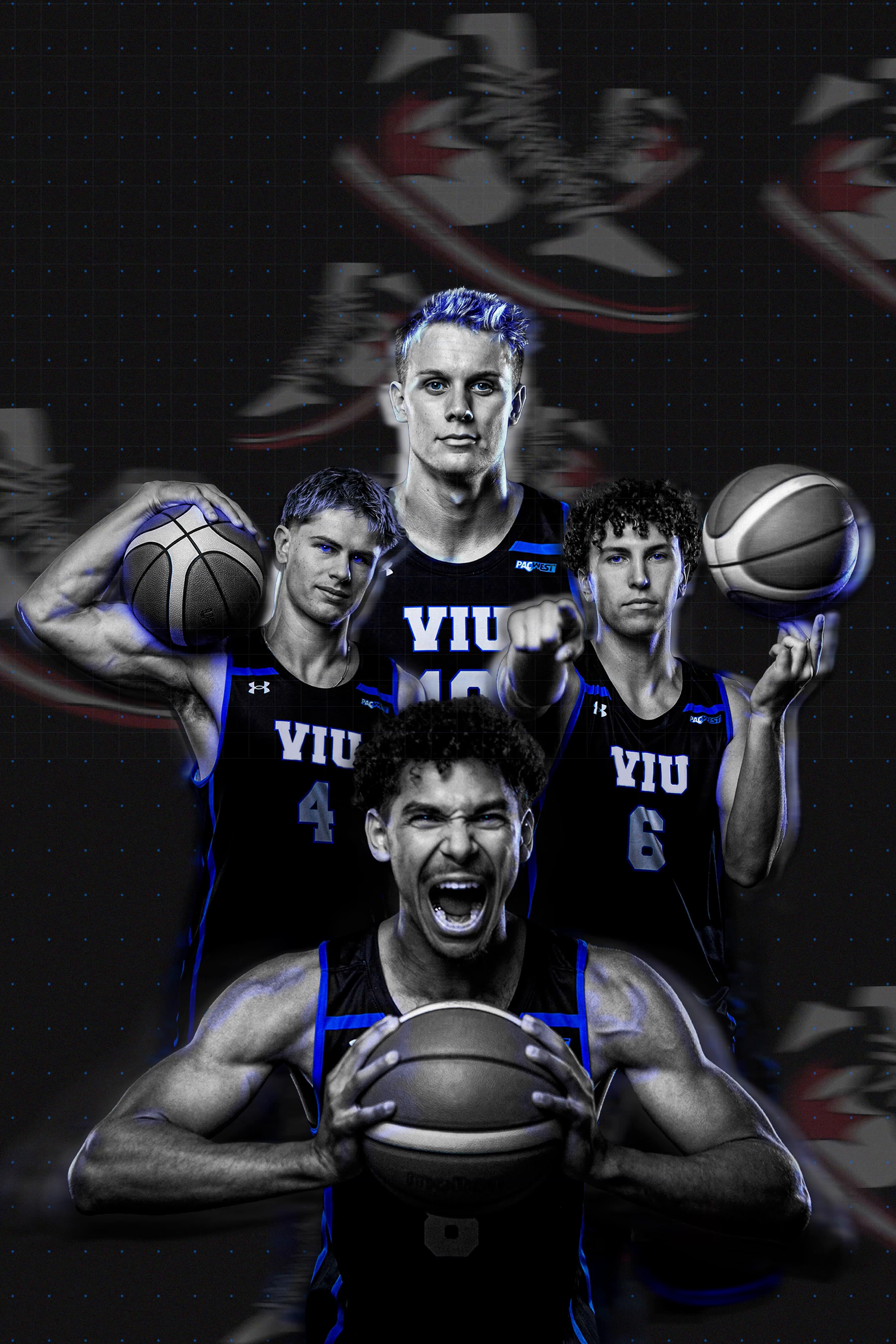
As part of my internship with the VIU Mariners Athletics and Recreation department, I developed the event branding system for the CCAA Basketball Nationals 2026, a national collegiate championship hosted by Vancouver Island University. This project required building a visual identity that could capture the intensity of championship-level basketball while remaining flexible enough to function across physical, digital, and environmental touchpoints. The final system was designed to support the full event experience—from pre-event promotion and social engagement to on-site wayfinding and tournament credentials.
The Challenge
The challenge was to create a cohesive event identity system for a national sports championship that needed to scale across a wide range of applications and audiences.The branding had to communicate the following:-The energy and competitiveness of basketball.-The professionalism of a national championship.-The host identity of VIU and the Mariners.-A system flexible enough for print, merchandise, social, signage, and digital assets.Because the identity would live across so many formats, the core challenge became: how can one visual system remain bold, recognizable, and adaptable across every stage of the tournament experience? This meant designing not just a logo, but a scalable event ecosystem that could perform consistently across everything from posters and player cards to tournament passes and website assets.
The Approach
My approach focused on treating the championship as a full event experience rather than a single campaign graphic. I began by analyzing how existing tournament identities build excitement through motion, contrast, typography, and team-driven storytelling. From there, I identified opportunities to create a system that felt energetic and immersive while staying highly functional.The visual direction centred on:-Bold, athletic typography
-High-impact composition
-Scalable iconography
-Modular layout systems
-Strong contrast for visibility in fast-paced environments.Because the system needed to extend across both physical venues and digital platforms, I prioritized flexibility from the start. Every design element, from the logo structure to supporting graphic assets, was developed with repeatable rules so it could adapt seamlessly to new applications.
Design Development
The logo mark was developed as the central anchor of the event identity, designed to feel dynamic, modern, and instantly recognizable.Supporting visual assets were then built around the mark, including the following:-Graphic motifs inspired by court movement and competition.-Typography systems for headlines, schedules, and scores.-Colour treatments that reinforce intensity and school spirit.-Layout templates for repeatable campaign useThis system-based thinking allowed the brand to stay visually unified while supporting a wide range of content types
Deliverables
I created a comprehensive branding ecosystem for the championship, including:Brand identity-Primary event logo
-Alternate lockups and scalable logo variations
-Typography hierarchy system
-Supporting graphic elementsPrint Production-Promotional posters
-Venue signage and wayfinding
-Tournament passes / credentials
-Player card tags
-Branded event materialsMerchandise:-Apparel graphics
-Branded merchandise applications
-Wearable assets for event staff, Athletes, and spectatorsSocial Media:-Social media promotional graphics
-Countdown and hype assets
-Player spotlight templates
-Game-day promotional contentWebsite + Digital Assets-I also developed visual assets intended for use across the event website and digital communication platforms, ensuring the identity translated effectively to banners, hero graphics, web sections, and promotional modules.-These assets were designed to support consistency between the in-person event and the online experience, creating a seamless brand presence before, during, and after the tournament.
Outcome
The final result is a multi-platform event branding system that captures the excitement of national-level basketball while remaining highly functional across every touchpoint. By designing beyond a single poster or logo and instead building a complete visual ecosystem, the identity supports fan engagement, athlete recognition, navigation, merchandise, and digital storytelling. This case study reflects my ability to think at both the brand level and systems level, creating design solutions that are strategic, scalable, and rooted in real-world event applications.
Contributors:Creative Direction + Event Branding: Stefan EmmanuelCommunications and Sports Information Coordinator + Project Oversight (Supported Graphics): Matt CarterPhotography: Mary KessenichDirector, Athletics and Recreation: Danielle HydeManager, Athletics and Recreation: David ForresterAthletics Coordinator: Jamie Macfarlane & Shayna Halsall
STEFAN EMMANUEL
Singha Arrack Spirits
Packaging Design
Adobe Illustrator & Photoshop
Sri Lankan heritage, bottled by hand

Mockups


Mockups

Mockups


Mockups


Mockups


Mockups

The Challenge
The challenge was to design a packaging system for a culturally rooted spirit that feels both authentic and contemporary. Arrack is closely linked to Sri Lankan culture and has strong ties to its heritage, but many existing products on the market today lack a modern visual presence. The goal was to create packaging that honours cultural identity while appealing to a broader, modern audience.
The Approach
My approach was to find a balance between cultural storytelling and minimal, structured design. I explored Sri Lankan symbolism and iconography, using the Singha (lion) as a central visual element to represent identity and strength. At the same time, I simplified forms and used a consistent layout system to ensure that the design remained clean, scalable, and cohesive across multiple variants.
Outcome
I designed a series of bottle labels built around a bold central icon and a consistent layout system. Colour was used to differentiate product variants while maintaining overall brand cohesion. Additional tactile elements were introduced to reinforce a sense of craftsmanship and authenticity. The final result is a packaging system that blends heritage with modern design, creating a brand that feels both rooted and relevant.
STEFAN EMMANUEL
Type Under Pressure
Editorial Design & Typography System
Adobe Indesign, Illustrator & Photoshop
An Experimental Typography Booklet on Play, Form, and Expression

Mockups


Mockups


Mockups


Mockups


Mockups

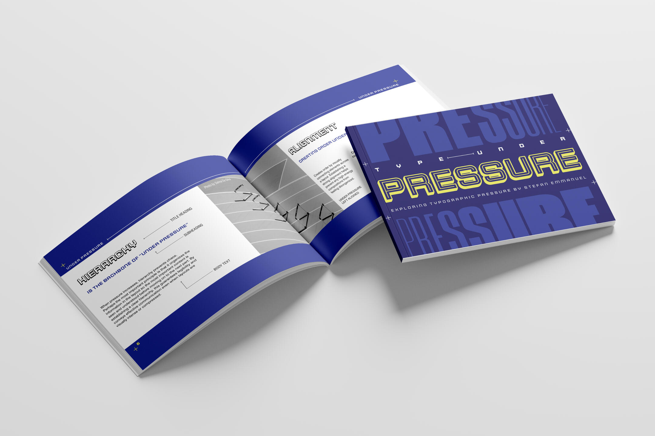
The Challenge
The challenge was to make an editorial booklet that talks about typography rules while still being clear and interesting to look at. Typography-based projects rely heavily on hierarchy, structure, and readability, so the difficulty was balancing expressive design with functional communication. How do you create something visually compelling while still prioritizing legibility and understanding?
The Approach
My approach was to treat typography as both content and form. I focused on building a clear system of hierarchy, scale, and spacing while experimenting with composition to create visual interest. I used contrast, rhythm, and pacing throughout the booklet to guide the reader and create moments of emphasis. The goal was to make the reading experience structured but still exciting.
Outcome
I designed a multi-page editorial booklet that applies key typography principles through layout, hierarchy, and composition. Each spread was intentionally structured to demonstrate clarity while maintaining visual variation based on the imagery. Through type scale, alignment, and spacing, the booklet communicates information effectively while showcasing typography as a visual system.
Why it Matters
The project explores how typography performs under constraint, limited space, dense information, and the need for immediate legibility. Inspired by magazine designs, athletic design systems, and fast-paced sports environments, the booklet treats pressure not as chaos but as a structured condition resolved through hierarchy, rhythm, and organized visual systems. This project reflects a broader design philosophy centred on building typographic systems that balance bold visual impact with clarity under constraint. Type Under Pressure shows how organized systems can turn complicated information into clear and energetic visual messages.
STEFAN EMMANUEL
Turno · Campus Sustainability
Turning Waste into value - recycling gamified
Brand Identity & Service Design
Adobe Illustrator, Photoshop, InDesign, Figma and Webflow
Recycling, gamified for the campus community.

Brand Guidlines


TURNO

TURNO

TURNO

TURNO

TURNO

TURNO

TURNO

TURNO

TURNO

TURNO

TURNO

TURNO

TURNO

TURNO

TURNO

TURNO


Overview
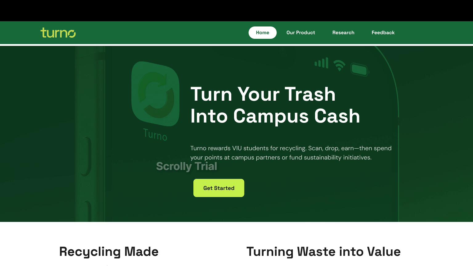
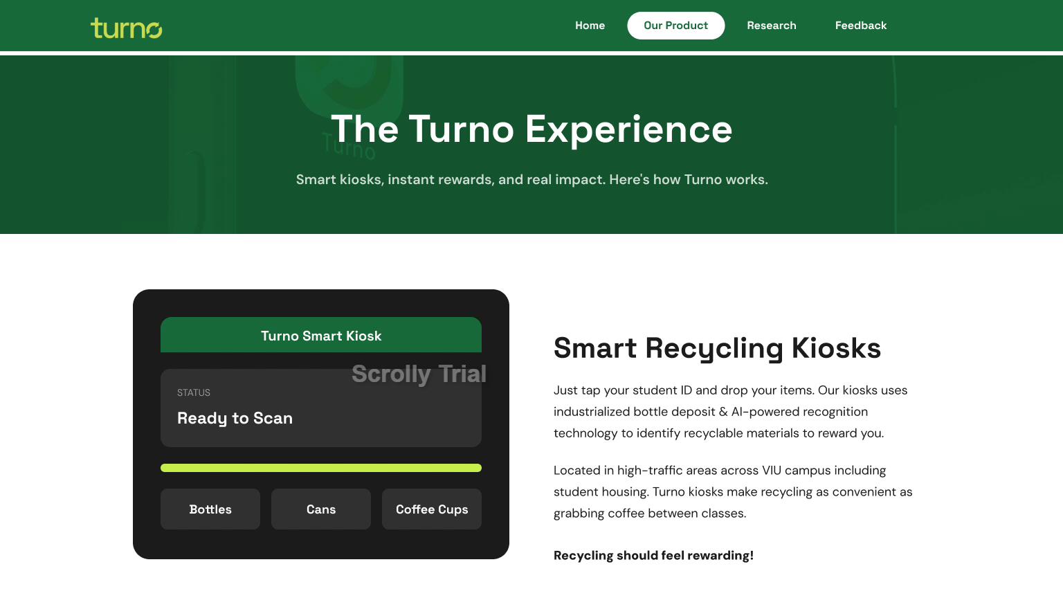
As part of my capstone project at Vancouver Island University, I designed Turno - a campus container return and reward service built for VIU students and staff. The project spanned brand identity, service design, app UI, physical collateral, and a web platform, developed across ARTG 480, ARTG 482, and ARTG 474. Turno is a reverse vending machine network placed across campus where students deposit beverage containers, tap their student ID, and instantly earn credits redeemable across campus. Operated by the VIU Student Union in partnership with the BC Federation of Students, the service is student-run and built on existing VIU infrastructure.
The Challenge
The challenge was to identify a real, solvable problem on campus and design a complete service and brand around a viable solution.
Campus waste was the starting point - hundreds of beverage containers are consumed at VIU daily, and most end up in the wrong bin or on the ground entirely. The existing infrastructure was there but the incentive was not.The core design question became: how do you change a passive, habitual behaviour without relying on guilt or obligation? The solution needed to be realistic, scalable, and genuinely useful to the students it was designed for.
The Approach
My approach began with research into existing systems that successfully change behaviour through positive reinforcement. TOMRA's reverse vending machine model proved the container return mechanic works at scale. Strava showed how leaderboards and social competition drive repeated engagement. Gaming loot drop mechanics informed the instant reward moment that makes the credit system feel satisfying rather than transactional. The VIUSU app informed the integration strategy - rather than building a standalone product, Turno plugs into systems students already trust and use daily. From there I developed the full brand identity, service model, digital platform, and physical touchpoints as one cohesive system.
Design Development
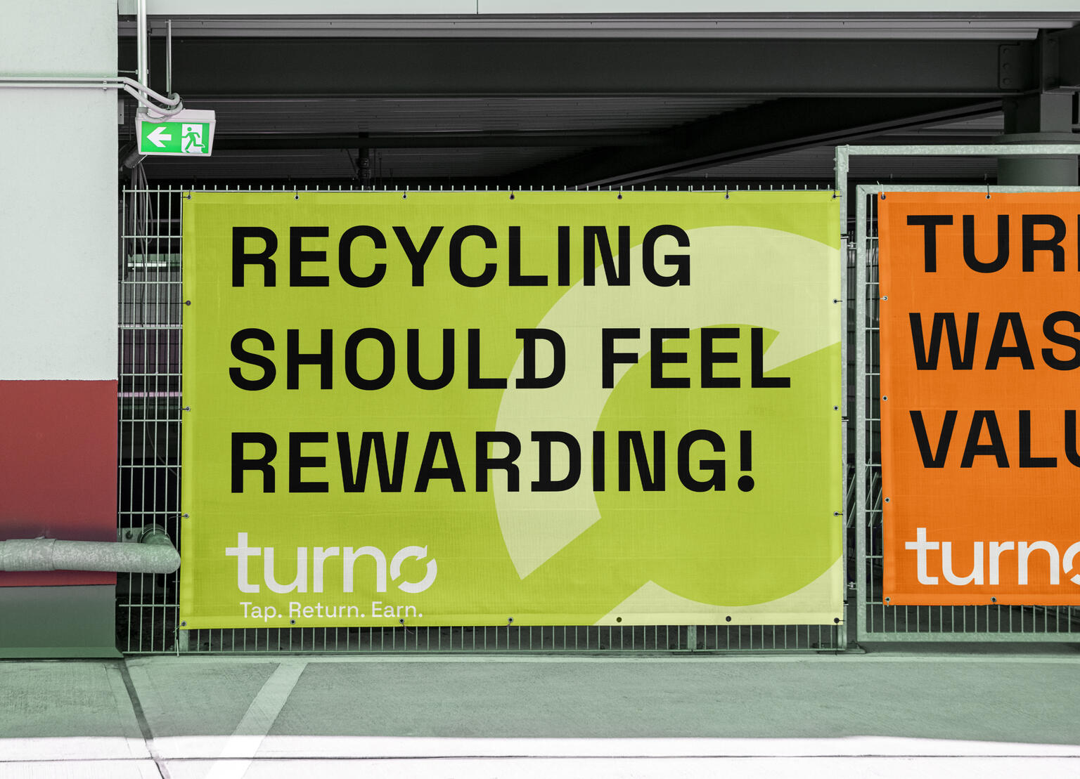
The Turno name was developed to communicate the service in a single word - you turn in your containers, turn waste into reward, and the circular loop of the word itself references the recycling cycle. The tagline It's your turn turns sustainability into an invitation rather than a mandate. The logo uses Space Grotesk ExtraBold with the recycling loop arrow replacing the O - making the wordmark and the mark inseparable. The colour system was built around three roles: Forest Green anchors the sustainability mission, Electric Lime provides digital energy and action, and Amber Gold is used exclusively for reward moments - so every time you see gold in the interface, you know you have earned something. The brand was then applied across a full system including machine wraps, app screens, a virtual student ID card, campus posters, a reusable cup, and a tote bag.
Deliverables
I produced a comprehensive brand and service design system for Turno including:
Brand Identity - primary and alternate logo marks, full colour palette with HEX, RGB, and CMYK values, typography system using Space Grotesk and DM Sans, brand voice and tagline development, and a complete brand board.
Physical Collateral - machine wrap signage design, campus leaderboard poster, reusable cup and tote bag mockups, and student ID virtual card design.
Digital Platform - app screen designs covering the home dashboard, leaderboard, and rewards redemption flow, a 5-page Webflow marketing website including Home, Our Product, Research, Brand, and Feedback pages, and a full Figma prototype with wireframes and interactive components.
Service Design - complete service model including machine placement strategy, credit earning and redemption system, gamification and leaderboard structure, governance model through the VIU Student Union and BC Federation of Students, and integration with existing VIU IT infrastructure.
Outcome
The final result is a complete brand and service design system that demonstrates how design thinking can address real campus problems through positive behaviour change. Turno moves beyond a recycling campaign and into a full service ecosystem - one that rewards students for doing the right thing, integrates seamlessly with existing campus infrastructure, and builds community through competition and shared impact. This project reflects my ability to work across brand, service, digital, and physical design simultaneously while keeping a clear, consistent concept at the centre of every decision.
Contributors:Creative Direction + Service Branding: Stefan Emmanuel
STEFAN EMMANUEL
Frame 26 · VIU Graphic Design GRADUATE EXHIBITION 2026
Brand Identity and Exhibition Design
Adobe Illustrator, Photoshop, InDesign, After Effects, Premiere Pro and Carrd.co (web design)
Think beyond the classroom. Beyond the frame.
Discovery, ideation, and planning stages

F26

F26


F26

F26


F26

F26


Social Media template designs

F26

F26


F26

F26


F26

F26


F26

F26


F26

F26


Merchandise designs

F26

F26


F26

F26


Event design and set up

F26

F26


F26

F26


Celebrating the Class of 2026

Class of 2026

invitation


Motion Graphics

Slideshow Video Recap presented at the exhibition

Motion Graphics Template used during the production stage

Dedicated social media posts introducing each and every designer

Social Media Reel Recap video celebrating the event and the graduates
Click the link to watch
*For more content, check out the VIU Grad show Instagram and website about the exhibition.
Overview
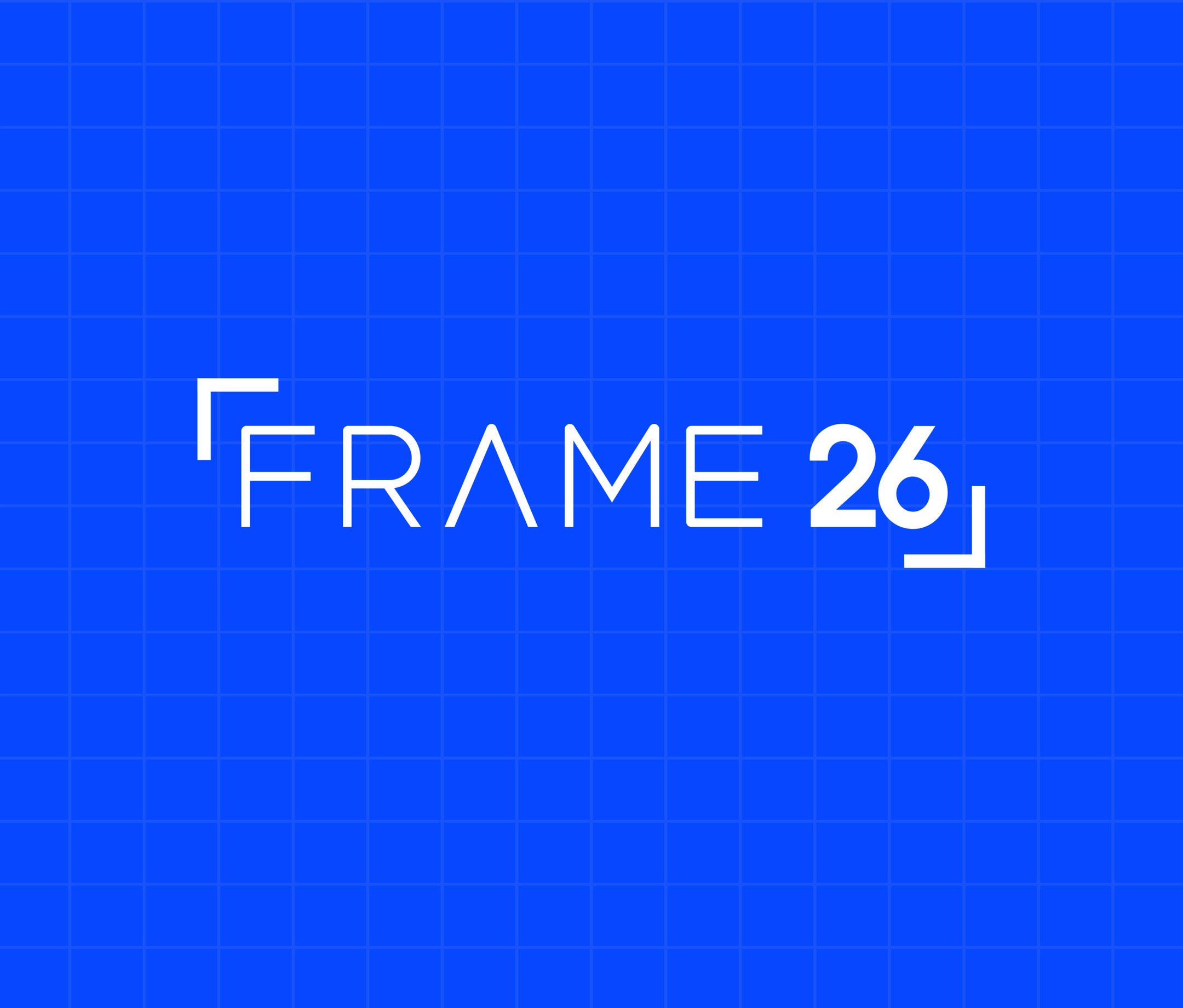
FRAME 26 is the visual identity developed for the 2026 Vancouver Island University Bachelor of Design (Graphic Design) Graduate Exhibition. Created as a collaborative class project, the identity celebrates the graduating cohort while providing a cohesive visual system that can be applied across digital, print, environmental, and promotional materials.
As Creative Director and Brand Identity Lead, I was responsible for developing the overall visual identity and establishing a flexible design system that unified every touchpoint of the exhibition. The goal was to create a brand that represented the diverse perspectives of the graduating class while communicating professionalism, creativity, and the transition from students to emerging designers.
The Exhibition
FRAME 26 is a celebration of perspective, process, and transition. Each project reflects a unique point of view, framed within a collective identity. Together, the Class of 2026 moves beyond the classroom and beyond the frame into the future of design.
The frame is set on April 11th, 2026, at the Trades Discovery Centre (Building 108). Join us in celebrating our 2026 graduates and the innovative work they've developed over the past four years. This year's class reimagines the event experience for the next era of graphic design and invites you to look beyond the frame.
The Challenge
Designing a visual identity for an entire graduating class required balancing many voices, disciplines, and design styles within one cohesive system. The identity needed to feel contemporary, memorable, and adaptable while remaining consistent across multiple applications, including posters, social media, merchandise, signage, and digital platforms.Beyond creating a recognizable brand, the system also needed to support the planning and promotion of the exhibition, helping attract students, faculty, industry professionals, and members of the public.
The Concept
The name FRAME represents more than a physical border. It symbolizes perspective, storytelling, and the act of presenting ideas. Every designer approaches creative problems through a unique lens, and FRAME 26 celebrates these individual viewpoints while bringing them together under one shared identity.
A frame highlights what deserves attention. It provides context, creates focus, and encourages viewers to engage with the work inside it. This concept reflects the purpose of a graduate exhibition: showcasing the creativity, growth, and accomplishments of the graduating class while marking the transition into professional practice.
The visual language embraces bold composition, structured layouts, and modular graphic elements that reference framing devices found in both digital interfaces and traditional design systems.
Design Development
The identity evolved through collaborative workshops, concept exploration, and multiple rounds of refinement. Initial research focused on previous graduate exhibitions, contemporary branding systems, editorial design, and environmental graphics to identify opportunities for creating a distinctive visual language.Early concepts explored themes surrounding perspective, collaboration, exhibition spaces, and storytelling. Through iterative development, the final identity established a modular framework capable of adapting across different formats while maintaining strong visual consistency.Particular attention was given to hierarchy, scalability, and flexibility, ensuring the system performed equally well across large-format signage, printed collateral, digital marketing, and merchandise.
Visual Identity
The FRAME 26 identity combines clean typography, structured layouts, and confident graphic framing elements to create a modern exhibition brand.A restrained colour palette allows student work to remain the focal point while providing strong visual recognition across all communications. Consistent spacing, grid systems, and typographic hierarchy reinforce clarity and professionalism throughout every application.The modular design system enables flexibility without sacrificing consistency, allowing multiple designers to contribute assets while maintaining one recognizable visual language.
Deliverables
The FRAME 26 identity was implemented across a wide range of exhibition materials, including:• Brand Identity System• Exhibition Logo• Posters and Promotional Graphics• Social Media Campaign• Digital Marketing Assets• Event Signage and Wayfinding• Merchandise• Presentation Graphics• Exhibition Communications• Environmental BrandingTogether, these deliverables created a unified experience before, during, and after the graduate exhibition.
My Role
In this role as Creative Director and Brand Identity Lead, I directed the overall visual identity of the exhibition while also contributing to several other production areas alongside my classmates.My responsibilities included:• Developing the exhibition name and visual identity• Designing the logo and brand system• Establishing typography, colour palette, and graphic standards• Creating marketing and promotional materials• Designing social media assets and content• Contributing to merchandise concepts and applications• Coordinating brand consistency across all class deliverables• Collaborating with the Grad Show Committee and Grad Show Coordinator throughout the planning and execution of the exhibition• Contributing to the exhibition's motion graphics• Supporting event coordination and on-site operations• Assisting with photo editing and providing creative direction for the graduating classmates' portraits
Outcome
FRAME 26 successfully provided the graduating class with a unified and recognizable visual identity that extended across every stage of the exhibition experience. The flexible design system supported a wide variety of applications while allowing individual student work to remain the primary focus.Leading the creative direction of this project strengthened my skills in branding, collaboration, creative leadership, and the design of scalable identity systems. The experience reinforced the importance of balancing strategic thinking with visual execution while managing the needs of multiple stakeholders within a collaborative design environment.FRAME 26 represents not only the identity of an exhibition but also a milestone that celebrates the collective achievements of the Vancouver Island University Graphic Design graduating class of 2026.
Contributors :
Creative Direction & Brand Identity:
Stefan EmmanuelMotion Graphics:
Sage Herrett, Stefan EmmanuelWebsite Design & Merch Store:
Sage Herrett, Ben Stewart Holland, Che Spetter, Stefan EmmanuelMerchandise Design:
Sage Herrett, Ben Stewart HollandSocial Media & Marketing:
Stefan Emmanuel, Mariana MendezEvent Coordination & Operations:
Stefan Emmanuel, Mariana MendezPublic Relations:
Mariana MendezPhotography, Documentation & Editing:
Mackenzie Beck, Stefan EmmanuelSpecial Thanks to Cory Landels & Kevin Mazutinec and Class of 2026Music by @mr20syl